Can Patterned Curtains and Patterned Wallpaper Go Together? Yes! Here's How
It’s one of the bravest moves in the interior design playbook. The very thought of pairing patterned curtains with patterned wallpaper can send even the most enthusiastic decorator into a spiral of self-doubt. It’s the peak of pattern play, a technique that promises a room rich with texture, depth, and personality. But it’s also a move that many shy away from, fearing a result that’s more dizzying than dazzling, more chaos than character.
We’re here to tell you: not only can it be done, but when done right, it’s one of the most effective ways to create a truly memorable, high-end designer space. The key isn’t to throw caution to the wind, but to follow a few core principles that ensure harmony reigns over havoc. If you’re ready to embrace your inner maximalist and create a space that feels truly special, this is the guide for you. Let’s break down exactly how to make this daring duo work beautifully.
The Cardinal Rule: Find a Common Colour
This is the most critical, non-negotiable starting point. If you take only one thing away from this guide, let it be this: your wallpaper and curtains must share at least one common colour to look intentional. This shared colour is the visual thread that ties the two distinct patterns together, telling your eyes that they belong in the same room.
- Method 1: The Obvious Match. The simplest way to achieve this is to pick a dominant colour from your chosen wallpaper—often the background shade—and find a curtain fabric that features this same colour prominently. For example, a blue floral wallpaper with a cream background pairs effortlessly with cream curtains that have a subtle blue pattern.
- Method 2: The Subtle Link. For a more sophisticated, designer-led look, pull out a less dominant accent colour from your wallpaper. Imagine a busy botanical wallpaper with greens, blues, and small pops of ochre. Choosing a curtain with a simple ochre pattern creates a clever and cohesive link that feels both deliberate and stylish.
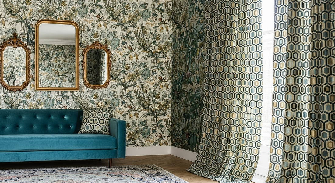
The Designer’s Secret: Create a Hierarchy of Scale
Once your colour story is set, the next principle is scale. If your wallpaper and curtains have patterns of a similar size and density, they will compete for attention, and the result will be a visual battle. To create harmony, one pattern must be the "star" and the other must be the "supporting actor."
- The Classic Approach: Large-Scale Wallpaper, Small-Scale Curtains. This is often the easiest and most successful route. Let a big, bold, beautiful print on your wallpaper take centre stage. This could be a large-scale floral, a dramatic damask, or a sweeping chinoiserie. Then, your curtains should feature a much smaller, more subtle pattern—think a simple ticking stripe, a small geometric trellis, a pindot, or even a solid-coloured fabric with a rich texture like linen or velvet.
- The Bold Reversal: Small-Scale Wallpaper, Large-Scale Curtains. This can be incredibly effective and chic. Use a small, repetitive pattern on the walls, such as a neat geometric, a tiny floral sprig, or a subtle dot. This creates an effect similar to a textured solid from a distance. Then, you can make a huge statement with curtains that feature a massive, dramatic print. This allows your window treatment to become the room's primary artwork.
The Golden Rule of Scale: Never, ever pair two large, bold patterns together. Let one dominate, and the other complement.
The Happy Couple: Pair Different Pattern Families
To add another layer of visual interest, it's often best to mix different types of patterns. Just as we discussed with florals and geometrics, this contrast creates energy and balance. Think of it as pairing different personalities that bring out the best in each other.
- Organic + Linear: This is the most classic pairing. Match a soft, curvy floral, botanical, or toile wallpaper with the clean, straight lines of a striped, checked, or plaid curtain.
- Geometric + Abstract: Pair a structured, repeating geometric wallpaper with the free-flowing, painterly feel of an abstract or watercolour-style curtain print.
The Rule of Rest: Let the Eye Breathe
When you have so much happening on your walls and windows, the rest of your room needs to provide a sense of calm. This is crucial for avoiding a look that feels overwhelming. You must incorporate "visual resting spots" – areas of solid, neutral colour that allow the eye to take a break.
- Furniture: Your largest pieces of furniture, like the sofa, armchair, or headboard, should ideally be a solid colour pulled from your shared palette.
- Flooring: Opt for a plain or subtly textured rug or carpet. A third, bold pattern on the floor is an advanced move that can easily go wrong.
- Bedding & Throws: If styling a bedroom, use plain bedding to break up the patterns of the walls and windows.
Frequently Asked Questions
1. Which should I choose first, the wallpaper or the curtains?
It's almost always easier to choose your wallpaper first. Wallpaper is often the bigger investment and makes a larger statement. Once your 'hero' wallpaper is chosen, you can take a sample with you to find curtain fabrics that pull colours and complement its scale.
2. Can I pair two floral patterns or two geometric patterns together?
Yes, but with great care. This works only if their scales are dramatically different. For example, a large, painterly floral wallpaper could work with curtains featuring a tiny, repetitive floral sprig. The key is extreme contrast in scale.
3. What if I fall in love with two patterns that are the same scale?
If you love both, don't use them on the walls and windows together. Instead, choose one for the wallpaper and use the other in much smaller doses, such as for a couple of scatter cushions, a lampshade, or to upholster a small footstool.
4. Is this 'pattern on pattern' look suitable for a small room?
Surprisingly, yes! A small-scale wallpaper can actually make a small room feel larger and more jewel-box like. The key is to stick to a lighter colour palette to keep the space feeling bright and airy, and ensure there's plenty of solid colour on the floor and main furniture.
5. How do I incorporate a patterned rug into this mix?
This is an advanced, maximalist technique. The rug would become your third pattern. It must strictly adhere to the colour palette and its scale should be either much larger or much smaller than both the wallpaper and curtain patterns. A large-scale geometric rug is often the easiest 'third' element to add.
6. What's the safest combination for a beginner to try?
The most foolproof combination is a large-scale floral wallpaper paired with a simple, two-colour striped curtain. The stripe should pick up the background colour and one accent colour from the wallpaper. It's a timeless look that always works.
7. My wallpaper is just a texture (like grasscloth or linen-effect). Can I use bold patterned curtains?
Absolutely! In this scenario, the textured wallpaper acts as a solid colour, providing a beautiful, subtle backdrop. You have free rein to choose almost any patterned curtain you like, as it will be the undisputed star of the show.
8. Does the material of the curtains and wallpaper matter?
It contributes to the overall mood. For a luxurious feel, you might pair a silk-effect wallpaper with velvet or linen curtains. For a more rustic country feel, a matte-finish wallpaper would work well with simple cotton or wool curtains. While they don't have to match, they should feel like they belong to the same style family.
9. How many colours are too many in a scheme like this?
To keep it feeling cohesive and not chaotic, it's best to stick to a palette of three, or at most four, key colours. For example: a main background colour (e.g., cream), a primary pattern colour (e.g., navy), a secondary pattern colour (e.g., green), and one small metallic accent (e.g., gold).
10. Is it okay if the background colours are slightly different shades (e.g., off-white and brilliant white)?
This can be tricky. Mismatched whites or creams can make one look dirty or yellowed in comparison. It is much safer to either have the background colours be an exact match or a deliberate, noticeable contrast (e.g., cream and pale grey).