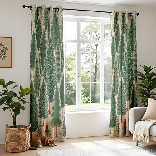
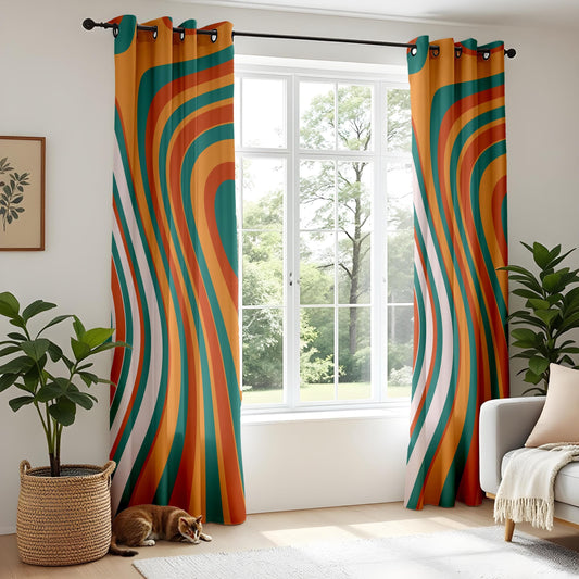
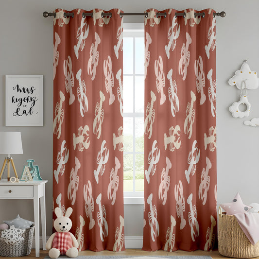
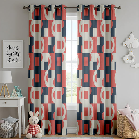
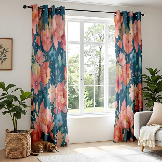
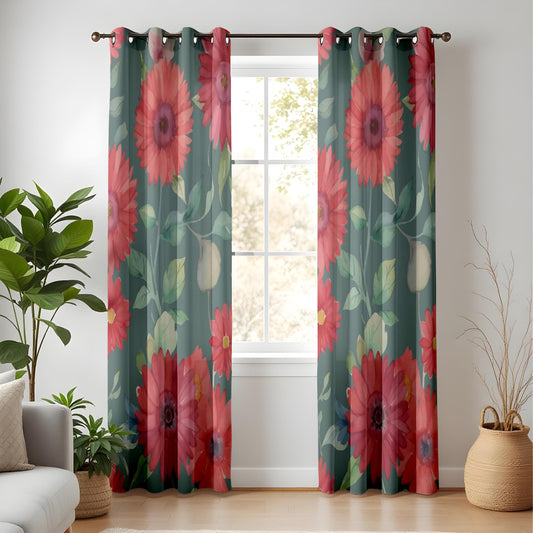
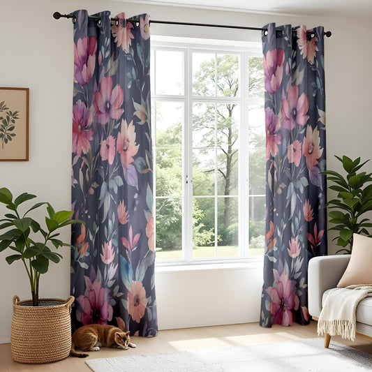
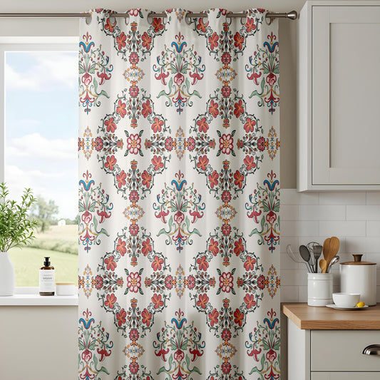
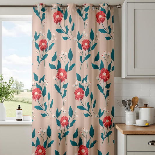
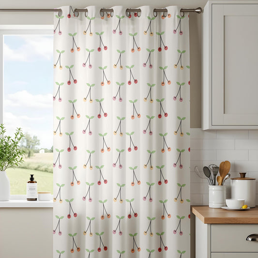
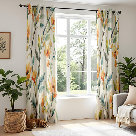
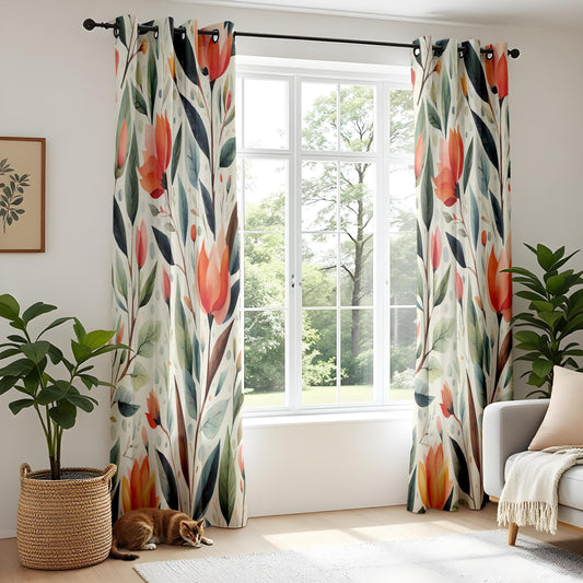
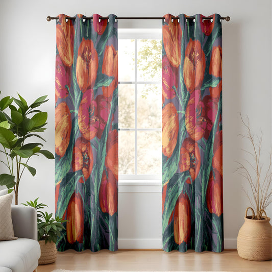
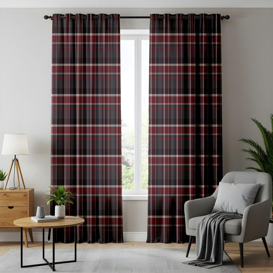
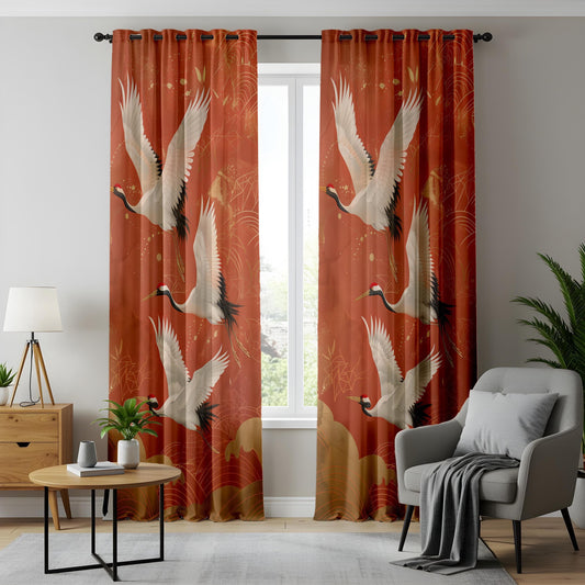
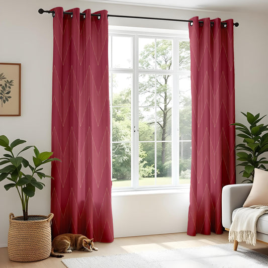
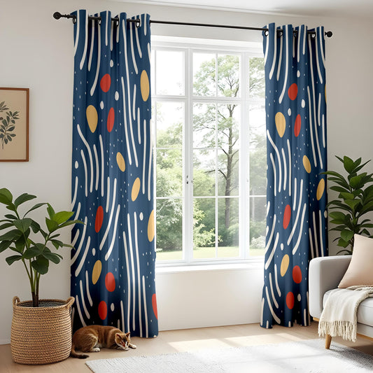
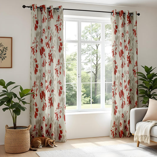
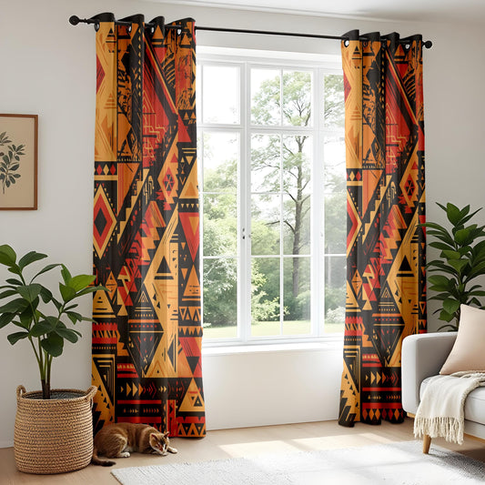
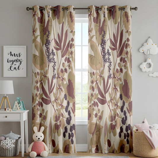
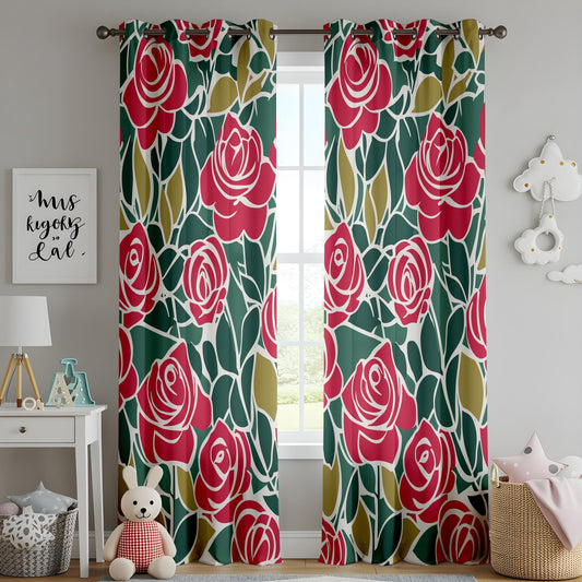
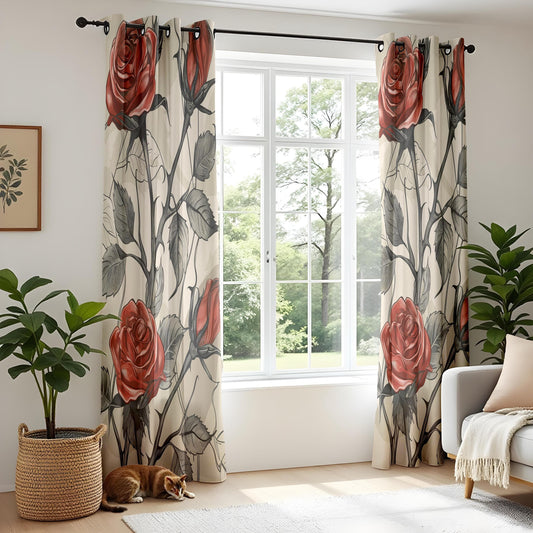
Red is the most decisive colour you can put at a window. It advances rather than recedes, it holds attention, and it changes the temperature of a room the moment it goes up. This collection spans the whole range, from soft coral and faded rose through terracotta and brick to deep claret and burgundy, in florals, geometrics and abstract prints. Every design is printed to your window measurements and available unlined, with blackout lining or with thermal blackout lining.
Where Red Earns Its Place
Red works best in rooms used in the evening. Under lamplight it deepens and glows, which is why it has been the traditional colour for dining rooms, studies and libraries for two hundred years. In daylight the same fabric reads brighter and more assertive, so the room genuinely changes character between afternoon and evening. That shift is a feature, not a problem, provided you choose the room to suit it.
-
Made for evening rooms. Dining rooms, snugs and studies are where deep reds do their best work, because artificial light brings out their depth.
-
Makes a large room feel intimate. Red advances visually, so it pulls the walls of a big, cold room inward and makes the space feel more enclosed.
-
Enormous tonal range. Coral and rose are light and fresh. Claret and burgundy are dark and enveloping. They behave like completely different colours.
Handling a Strong Colour Well
Red needs a quiet setting. Plain walls, restrained furniture and one or two supporting colours are enough. The most common error is pairing a strong red with a strong secondary colour, which turns the room into a competition. Give the red the lead and let everything else defer to it.
-
Dining rooms. Deep claret or burgundy panels are the classic choice, and they look their best under candlelight and warm bulbs.
-
Living rooms. Terracotta and brick are the manageable end of the range. They read as warm and earthy rather than bold, and they pair naturally with wood and cream.
-
Studies and libraries. Red alongside dark timber and books is a long established combination that still feels considered rather than nostalgic.
-
Bedrooms. Choose faded rose or dusty coral rather than true red, and add blackout lining so the colour stays soft by day and the room darkens fully at night.
Choosing the Right Lining
Every design in this collection is available with three lining options, so you can match the look to how the room is actually used.
-
Standard (Unlined): A single layer that lets daylight filter softly through the print. The colours stay luminous and the fabric hangs lightly, which makes it the natural choice for kitchens, dining rooms, hallways and any room where you want brightness rather than darkness.
-
Blackout Lining: An opaque backing layer bonded behind the printed face. It blocks external light almost entirely, so it is the option for bedrooms, nurseries, shift workers and home cinemas. It also adds body, giving the curtain a fuller, heavier fall.
-
Thermal Blackout Lining: Everything the blackout lining does, plus an insulating layer that slows heat loss through the glass in winter and reduces solar gain in summer. If you are trying to bring heating bills down or you have a draughty bay window, this is the one to choose.
Each design is also available as a single panel or a pair, in ten standard drops, so you can dress a narrow landing window and a wide living room bay from the same collection.
Made to Measure, Made to Order
Nothing in this collection sits in a warehouse waiting to be picked. Your fabric is printed and your curtains are sewn after you order, which is why the size and lining you choose are made exactly as specified rather than approximated from stock. Production takes 8-10 days, and delivery is free worldwide.
If you are torn between two designs, order fabric samples first. Screens shift colour, and a print that reads as soft sage on a phone can look considerably deeper against your own wall in your own light. A sample costs a fraction of a full order and removes the guesswork entirely.
Frequently Asked Questions About Red Curtains
1. Are red curtains too overwhelming for a normal living room?
Only if the red is bright and everything else in the room is also busy. The earthy end of the range, terracotta, brick and rust, behaves much more like a warm neutral and sits comfortably in an everyday living room. If you want true red, keep the walls, sofa and rug plain, and let the window be the one place the colour appears at full strength.
2. What colours pair well with red curtains?
Cream and warm white are the safest, because they give the eye somewhere to rest. Deep green is the classic contrast and produces a rich, traditional room. Navy works with the darker reds and gives a more tailored result. Avoid pairing red with orange or bright pink, where the two colours sit too close together to create contrast but too far apart to harmonise.
3. Will red curtains make a small room feel smaller?
Visually yes, because red advances. Whether that is a problem depends on the room. In a small dining room or snug, the enclosing effect is desirable and makes the space feel intimate rather than cramped. In a small room you want to feel airy, such as a bathroom or a north facing bedroom, choose the pale end of the range or a red motif on a light ground.
4. Do red curtains fade badly in the sun?
Reds are more prone to visible fading than most colours, because the pigments sit at the warm end of the spectrum where sunlight does most of its work. On a south or west facing window this is worth planning for. A blackout or thermal blackout lining takes the direct exposure on the back of the curtain and shields the printed face, which makes a real difference over several years.
5. Is red still used in modern interiors?
Very much so, though usually in its earthy forms. Terracotta, brick, rust and clay have been central to contemporary schemes for several years, valued for the warmth they bring to otherwise neutral rooms. Bright pillar box red is the shade that reads as period specific, while the muted reds look thoroughly current.
6. How do I measure my windows for made-to-measure curtains?
Use a metal tape measure, not fabric. Width: measure your pole or track, not the window, and let the pole extend 15cm to 30cm beyond the glass on each side so the curtains can stack back without blocking light. Drop: measure from the pole or track down to where you want the curtains to finish: 1cm above the sill, 15cm below the sill, or 1cm to 2cm off the floor for full length.
7. What is the difference between blackout and thermal blackout lining?
A blackout lining is about light: an opaque layer that stops daylight and streetlight coming through. A thermal blackout lining does the same job and adds an insulating layer that slows heat moving through the window, keeping rooms warmer in winter and cooler in summer. If your priority is sleep, blackout is enough. If it is comfort and energy bills, choose thermal blackout.
8. How should I clean my printed curtains?
Professional dry cleaning only. The printed face and the bonded blackout and thermal linings do not respond well to machine washing, which can shrink the fabric and separate the lining. Between cleans, a vacuum with the soft brush attachment on a low setting keeps dust from settling into the weave.
9. How long will my order take, and what does delivery cost?
Every order is printed and sewn from scratch, so allow 8-10 days for production. Delivery on curtains is free worldwide. Orders to the United States are sent DDP, meaning import taxes and duties are already covered and there is nothing to pay when the parcel arrives.
Explore more: Pink Curtains, Purple Curtains, Multicolour Curtains, Floral Curtains and Botanical Curtains. Or narrow the choice by lining with Blackout Curtains and Thermal Curtains, or browse every design in Curtains.